Tom Jung: The Man Behind The Posters
Thomas Jung (known as Tom Jung) was born on 13th February 1942 and is an advertising art director, graphic designer and illustrator who is best known for his movie poster artwork and his work as a motion picture storyboard artist. Tom has worked on movie poster artwork for films such as Doctor Zhivago, Grand Prix, Le Mans, Star Wars, The Dogs of War, The Empire Strikes Back and Once Upon a Time in America.
Tom Jung studied at the School of the Museum of Fine Arts in Boston, Massachusetts. Whilst he was studying he was drafted into the Army and during this time while stationed at Fort Jackson in Columbia, South Carolina, he worked on the newspaper Fort Jackson Leader as an editorial cartoonist, designing and illustrating primarily public service communications. Following his discharge from the Army, he worked freelance as an illustrator and art director with many well-known advertising agencies in New York.
In 1958, he was hired by Ben Adler Advertising Services Inc. to redesign advertising campaigns for foreign films to suit an American audience. He created press books and posters that were distributed to independently owned cinemas throughout the country. His work on the films La Strada and And Woman… Was Created, helped introduce the magical genius of directors Federico Fellini and Roger Vadim to US audiences.
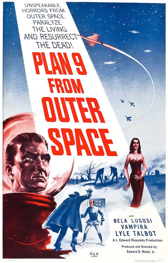
An early project that Tom worked on was for the 1959 film, Plan 9 from Outer Space, a film awarded the title of “worst movie ever made” by Michael and Harry Medved in their 1980 book The Golden Turkey Awards: Nominees and Winners, the Worst Achievements in Hollywood History. Later, Tom would go on to work on the design and illustrate the ‘Style A’ poster for Star Wars, one of the most widely acclaimed films ever made. He carries an unusual distinction of having worked on the best and worst movies made in the last fifty years.
In 1963, he worked as a freelance art director for Metro-Goldwyn-Mayer, where he designed posters for titles such as Doctor Zhivago, Grand Prix, Far from the Madding Crowd, Ice Station Zebra, and The Shoes of the Fisherman. The design process at MGM was incredibly time-consuming and meant illustrating multiple poster concepts, carefully rendered in pencil or charcoal with or without copy lines and credits in position for approval. Once approved these would be given to the selected illustrator to prepare a full-colour painting.

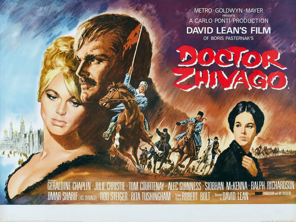
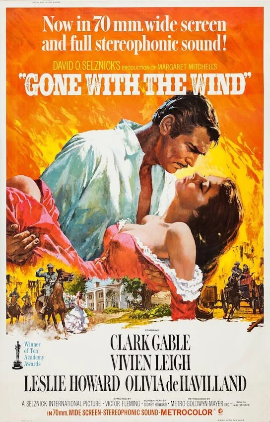
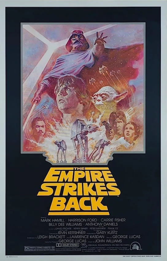
For the 1967 re-release of Gone With the Wind, Tom selected Howard Terpning to illustrate his concept art. Tom’s iconic pose on the poster is often imitated by others, most notably in the Style A poster for The Empire Strikes Back. Tom said “I see the results of my design all over,” he said. “Gone With The Wind was really notable for its schmaltziness”. In addition, to Gone with the Wind, Tom worked with Howard Terpning on another six occasions for the artwork on Lady L, Doctor Zhivago, Grand Prix, Far from the Madding Crowd, Ice Station Zebra and The Shoes of the Fisherman.
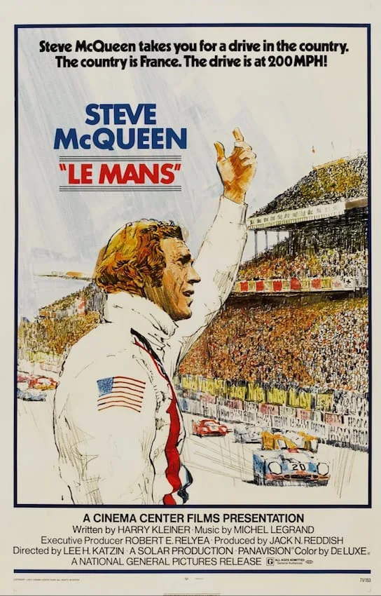
In 1968, Tom was hired by Bill O’Hare, vice president of advertising at CBS’s television network’s theatrical film division Cinema Centre Films, to work on the art direction of their entire release schedule of nearly thirty films. With the help of resident artist, Vincent Marrone, Tom designed and illustrated for films such as A Man Called Horse, Little Big Man, Prime Cut and Le Mans starring Steve McQueen.
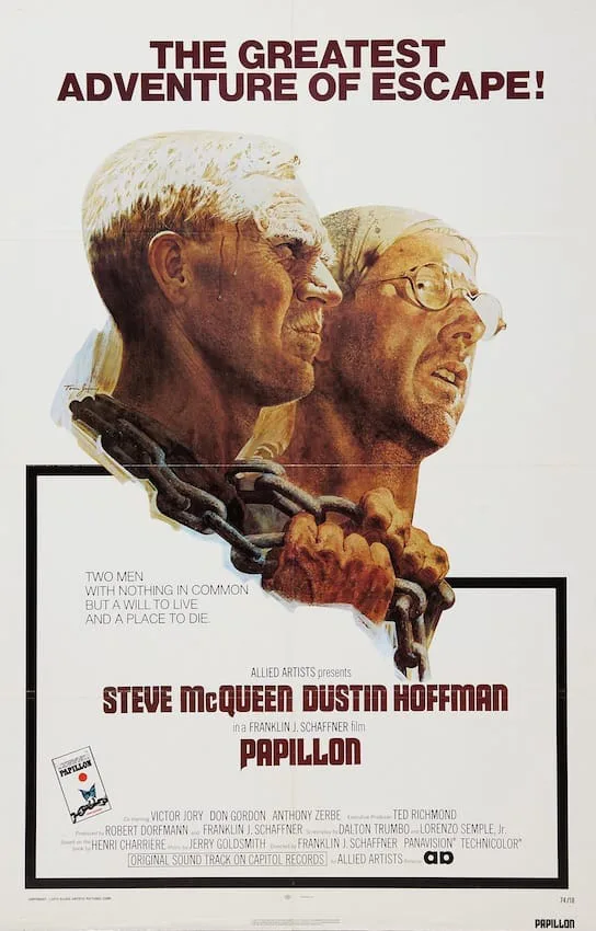
In 1973, Tom worked on the artwork for Papilion. He said “It was obvious that Dustin Hoffman and Steve McQueen had unique roles in Papillon, Steve represented, at that time, a gut of defiance that any person would identify with … defiance against oppression and authority. The poster made with this theme merged perfectly with the mood of the film”.
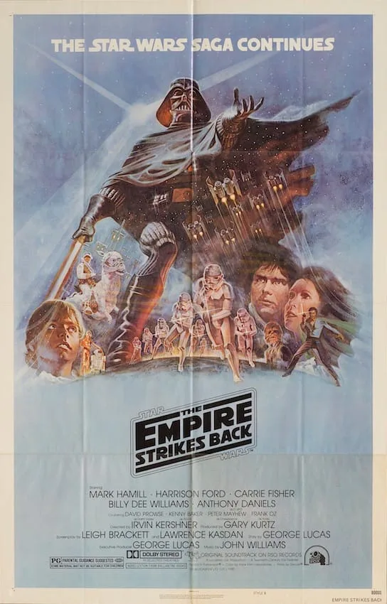
While working as a freelance illustrator in 1977, Tom was chosen to work on Star Wars. Prior to completing the artwork, he was given the theme of ‘Good Over Evil’, along with photos in colour and black & white, 2.25-inch stills on contact sheets taken from the original 35mm print of the film. His work was used on the ‘Style A’ one sheet. According to Tom, the “cross” which is formed by Luke Skywalker’s lightsaber set against the ghosted background image of Darth Vader was Tom’s homage to the good vs evil theme.

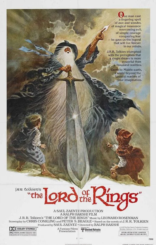
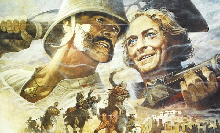
In 1978, he worked on the artwork for Lord of the Rings. His artwork was chosen for the ‘Style B’ poster design and showing Gandalf with the Hobbits, Frodo and Sam, is rendered in a different style Tom’s previous artworks. He said, “There’s probably a lot of posters I’ve done that people aren’t aware of: Papillon, The Man Who Would Be King, and … for Lord of the Rings”. The poster won first prize for Best Graphic Award in 1978 from the International Society of Science Fiction, Horror and Fantasy.
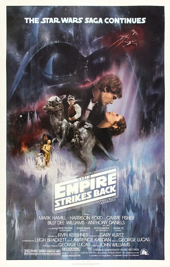
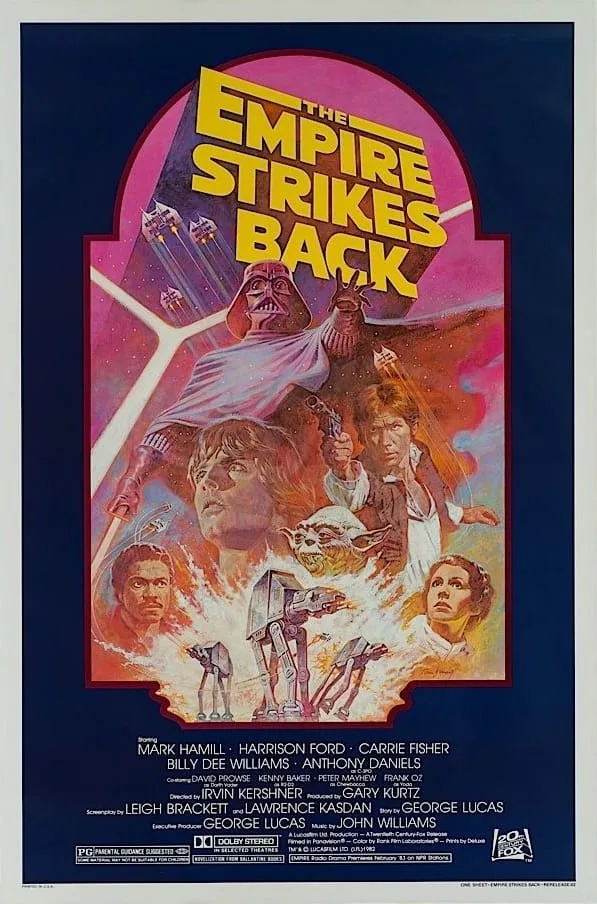
With the work he completed on The Empire Strikes Back in 1980, Tom said “I used various martial arts attitudes in my working studies, trying to come up with the perfect look. I was searching for the image ‘bicoastal’ (as they used to say) of Darth Vader, which could be the centrepiece for The Empire Strikes Back. I made the presentation to Sid Ganis at Lucasfilm’s new offices in North Hollywood, near Universal Studios. In the large airy reception area sitting on couches, with my presentation spread on a coffee table, we attracted a small crowd of onlookers. Steven Spielberg peered in and chimed, ‘I like that’ and strolled away. It was the drawing of Darth Vader in profile, a powerful outstretched arm holding his lightsaber”. As well as completing the work on the ‘Style B’ movie poster he later went on to complete the artwork on the 1981 and 1982 re-releases.
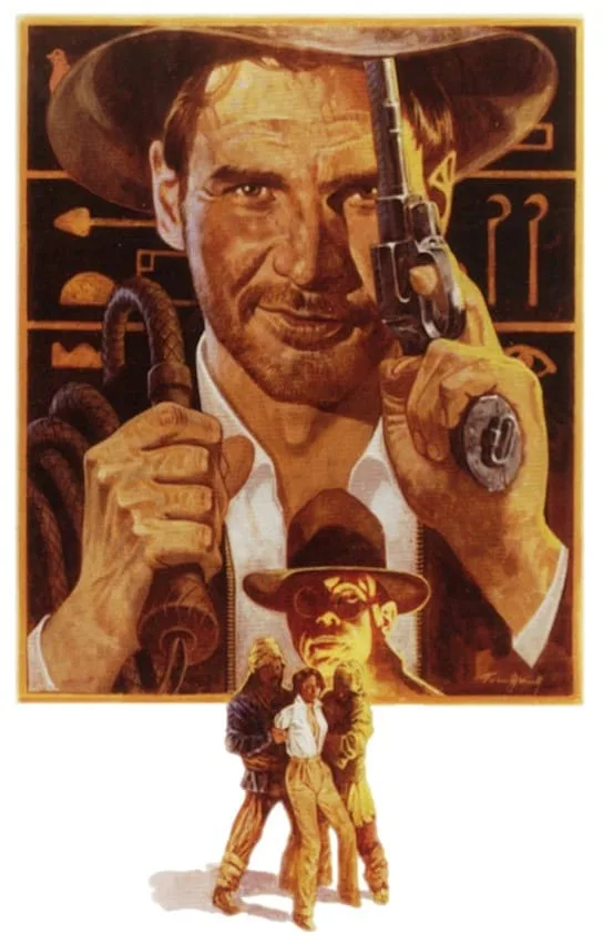
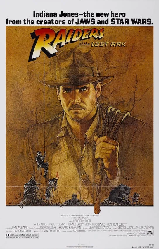
In 1981, Tom was contacted by Sid Ganis of Lucasfilm, to develop concept sketches for Raiders of the Lost Ark. At the same time, the production company Paramount Pictures had contacted another illustrator, Richard Amsel, to develop a marketing campaign. Tom created sixteen different concepts, one of which was chosen to go to colour. He borrowed the artwork style from his previous work on Papillon and used a brown palette with a unique concept to create the iconic character Indiana Jones for his interpretation.
After many months of modifications to the concepts, it was decided that Richard Amsel’s artwork would be used for the poster. The decision was partly made on the view that Indian Jones should not be shown with a gun. In Tom’s artwork, a gun and whip feature prominently being held in Indiana’s hands, however, although the concept was not used it is preserved in the Lucasfilm archives.
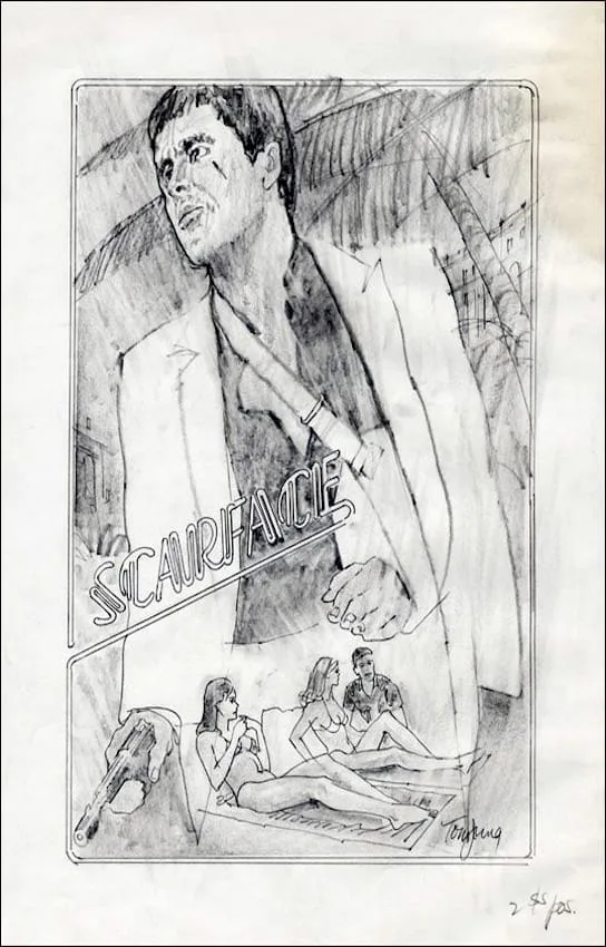
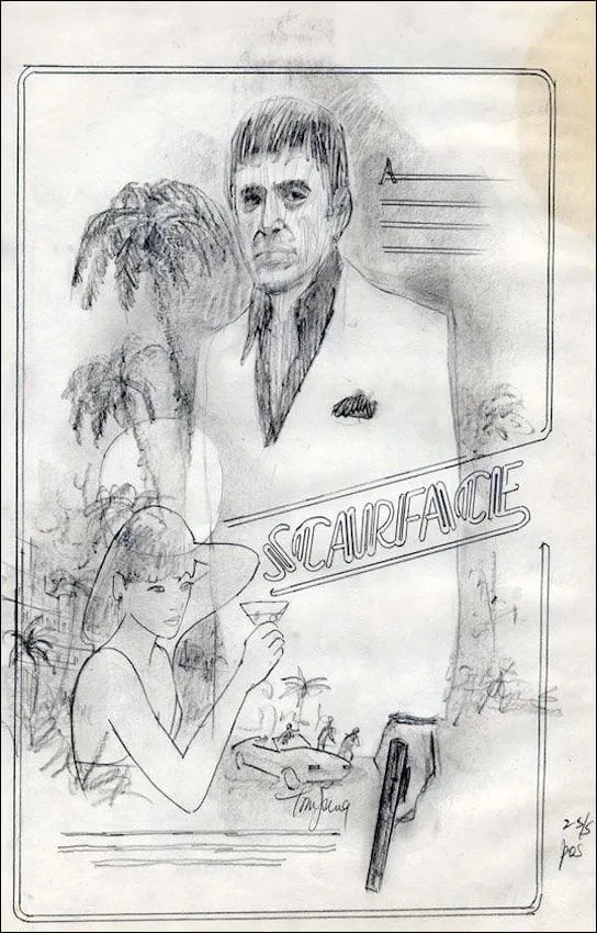
In addition, to the key art Tom produced for Indiana Jones, he also worked on the key art for The Prince and the Showgirl (1957), The Wheeler Dealers (1963), Smile (1975), F.I.S.T. (1978), Apocalypse Now (1979), Scarface (1983) and Heat (1986). The concept art for Scarface is shown below.
In 1997, Tom began working on the production side of the business as a storyboard artist. His first role was with the Disney film Jungle 2 Jungle. His ability to work without the need of visual aids helped his transition to storyboard artist fairly simple. He also worked on The Perfect Storm, The Salton Sea and Disturbia.
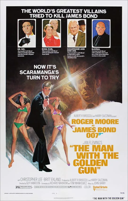
In an interview, Tom was asked about his design and illustration work on The Man with the Golden Gun ‘Villains Style’ in 1974, he said “The actual painting is done on 20×30 double-weight illustration board, half of a standard 30×40 board. I used acrylics, I can use it transparently or opaquely; it dries quickly and is permanent and can be reworked. I’d use airbrushing for large areas of background, colour pencils, and inks and dyes and tempera and whatever else I think that may give me the desired result. Sandpaper. Brillo. A single-edge razor blade. Whatever works”.
Tom would often use members of his family as models. When he worked on the Star Wars poster design and with Frank Frazetta in mind has his final illustrator, he used his son Jeff as Luke Skywalker and his wife Kay as Princess Leia. After discussion, it was decided that Tom would complete the illustration.
Tom Jung: The Man Behind The Posters » The Poster Collector
Meet the man behind some of the worlds most iconic movie posters in our Tom Jung biography including images of his work and early career
 postercollector.co.uk


